Saturday, September 5, 2020
Monday, April 6, 2020
The History of the Anaglyptograph
An anaglyptograph is an ingenious
nineteenth century instrument comprising a gramophone-like needle that traces the
surface of a three dimensional object and, by its particular construction,
converts the relief movement of the needle (input) into a horizontal deviation
proportional to the relief height of the object (output). Crucially, by
attaching an engraving tool to the output, and placing a blank plate under
that, the anaglyptograph would engrave a copy of the three dimensional object.
Prints could be taken from the engraved plate and published in a books.
In the earliest times, a
technician would painstakingly trace the needle across the object hundreds of
times, each at a different offset. In later systems, a mechanical arrangement
replaced the human technician and enabled automatic tracing.
Higher quality could be achieved
by spacing tracing lines more densely, but it was also possible to synthesize a
directional light source: by choosing the azimuthal angle of the tracing lines
and the elevation angle of the needle, the engraving would have the sparsest
lines (and lightest apparent shade) for relief ascents at a selected angle and
the densest lines (and darkest apparent shade) opposite that orientation.
The history of the anaglyptograph
is well told in [Stannard1859] and by Dick Johnson
in [Johnson2017]. Gobrecht, an associate of Jacob
Perkins and living in Philadelphia, was first to publically report his
construction of a crude device, in 1817. Asa Spencer, an American artist and
banknote engraver, built one or more machines based on Gobrecht’s design, and
took one to London in 1819. A gentleman there purchased the machine, and, upon
the gentleman’s death, it passed to John Bate, Optician to the Admiralty. In
Stannard’s telling, Gobrecht’s design was crude in several senses but
aesthetically the most important was that the device would create a distorted
tracing of the relief, where the greater the depth of the relief, the greater
the distortion. Bate’s goal was to reduce or lessen this distortion, and indeed
he “succeeded in effecting an alteration in the principle of the machine, by
which the distortion was wholly removed, the change being a very ingenious
application of a mathematical relationship between certain lines.” In 1832,
Bates received a British patent, Machinery to Produce Imitations of Medals,
Sculpture, &c., number 6254, for his design.
In Johnson’s telling, the more
important personage was Achille Collas, a French mechanic, who independently re-invented
the same device and produced his first successful engraving 1831. A French
businessman Nolte acquired the rights and persuaded a publisher of
encyclopedias, Lachevardiere, to join the venture as a manager. Their company
went on to publish 20 volumes of medals, coins, seals and small bas-reliefs
over 24 years.
Regardless, it is Bate who
carefully documented his machine by way of his patent, and to which posterity
is most grateful.
 |
|
To complement the following text, on Windows using a Chrome browser, click on the image, then right click on it to open in a new tab, then click again to maximize the image. Other operating systems and browsers may offer similar functionality.
Image (and patent text) kindly provided by British Library Reference Services |
Using the spelling of his era, Bate
describes its operation thus: “Figure 1, represents a side elevation of my
improvement on machinery applicable to the imitation of medals, sculpture, and
other works of art executed in relief. A-A represents a fragment of a
board or table, and B shews a vertical section of a brass socket fixed
thereto. C is a square brass standard made to slide up and down within
the socket, being very accurately fitted. D is a steel screw, having a
micrometer attached at its lower end, by which means it can be turned so as to
move the standard C at equal distances, either ascending or descending. E
shews a plate of metal fixed to the standard C, and inclined to the
horizontal plane of the table or board A-A, at an angle of forty-five
degrees. The upper edge of this plate has a groove formed in it to receive two
bevelled rollers of a carriage, now to be described. F represents a
carriage, which moves very freely on the plate E by means of three
rollers, two of which are bevelled so as to enter the groove formed to receive
them or the upper edge of the plate E. In this view only one of the
bevelled rollers a can be seen, the other being immediately behind it.
These rollers are made with long axes, and very accurately fitted in their
bearings, so as to move freely without shake. The lower part of this carriage
is supported and moves on a single roller, b, the axis of which is
placed at right angles to those already described, the periphery revolving and
resting upon the ledge c. d-d represents a sliding plate, which
is made very true and parallel on two of its edges, and these are bevelled on
each side so as to produce a double prism. The champhered edges so formed enter
the grooves of four rollers fixed in the carriage F; two of these
rollers are seen near e-e; the other two, being placed immediately
behind, cannot be seen in this Figure. By these means the sliding plate d-d,
is made to move very freely, and yet with great accuracy. f represents a
point fixed to the sliding plate d-d; this is used to trace over any
medal or any other suitable work of art that is required to be copied; G
shews a section of a portion of a sphere rising from a plane surface, and
similar to a medal in its general form. Any such subject may be fixed to the
supporting frame H by any suitable cement, care being taken that its
plane be placed in a proper position. I is a metal guide fixed at its
lower end to the sliding plate d-d; the upper portion of this is formed
into a straight edge at g and stands perpendicular to A-A. K
represents a vibrating lever, the arms of which are equal; this swings freely
on two conical points, one of which is seen in the arm L fixed upon the
carriage F. The upper end of the vibrating lover has a friction roller L
placed in it, which is always kept in contact with the straight edge of the
guide g, by the spring i, while the lower end of the lever moves
the frame M, at the end of which the diamond point is fixed, as shewn at
j, perpendicular to the surface of the copper plate N, which lies
parallel with A-A. The left-hand end of the point frame M is
jointed on each side to the lower end of the vibrating lever K, forming
an elbow joint therewith, the pivot- or bearings being made conical, so as to
avoid friction as much as possible. p represents a small barrel fixed on
an axis, one end of which turns in the end of the arm q, and is retained
in any position by friction. The other end has a flat button formed on it by
which it may be turned. r shews a small silk cord; one end of this is
coiled round the barrel p, and the other is attached to the point frame M.
By these means the diamond point may be raised from the plate and kept
suspended at pleasure. 0 represents a metal plate fixed to the bracket p,
which is firmly attached to the inclined plate Z. There are two such
brackets, one is supposed to be removed, to shew the parts that would otherwise
be hidden. Q, represents the plate carriage, which has three friction
rollers placed in frames under it. Two of these rollers are bevelled and run in
a groove formed in a plate 0; the other roller is plain, and rolls on
the surface of tho same metal plate. k is a steel chain, one end
attached to the arm B and the other, at t, to a stud projecting
from the under side of the plate carriage Q. m shews a cord made
fast at one end to the stud near I, and passing over the pulley n,
it hangs down and has the weight 0 appended to it, by which means the
carriage will be drawn along in the direction of the dart, whenever C is
lowered by the micrometer screw D. When this machine is to be used, the
micrometer screw D should be placed in the centre of its range, as shewn
at D in Figure 1, and then the medal or other object to be traced over
must be placed at such a height that the tracing point f may be brought
just in contact with the centre of the medal or other object. When the sliding plate
d-d, is placed in the centre of the limits or range that it has to move
in between the rollers that confine it, the centre of the copper plate N
must at the same time be placed immediately under the diamond point with its
edges parallel to the plate Q, . The machine and plate being thus
adjusted, the micrometer screw D must be made to raise the standard C,
and all tho parts combined therewith, until the tracing point f will
nearly reach the top of the medal or other subject G, at s The
tracing point must then be laid hold of by the hand, and brought into contact
with the surface at s (moving the screw D as may be required, to
bring the tracing plate d-d, into its mean position) by means of the
combined motions of d-d, and F. The machine will then be in the
proper position for beginning the first line, when the button t must be
turned, and the diamond point gently let down upon the copper plate, and the
tracing point f being then passed very carefully over that part of the
medal which presents itself to it, the diamond point will then be found to have
etched a line on the copper plate exactly corresponding to the undulations
which the tracing point has passed over on the medal. The diamond point must
then be raised from the plate, and the micrometer screw must be turned so as to
produce such a space between the lines on the copper plate as may have been
previously determined upon, and the same movements repeated, until the whole
surface of the metal has been traced over. When sculpture and other works of art
are to be traced over, and the undulations of the tracer transmitted to a plate
so as to produce a copy thereof, such works must be placed before the tracer f,
in vertical position, and the mode of setting and adjusting the machine, and
also the copper plate, must be adopted as before described, and then if the
tracer f bec made to pass over every part that the tracing point will
reach, such undulations will be transmitted to the copper plate, and a correct
representation will be the result. In some works that are executed in very high
relief, it would be quite impossible to reach many parts that are in deep
recesses with a point of the ordinary conical form, but for such purposes I
have invented the following instrument, which I call a tracing blade.”
The tracing blade is shown in
Figure 2. Figure 3 presents a front view of Figure 1.
Sunday, April 5, 2020

Thursday, April 2, 2020
From Wyon Medal to the New Zealand Sidefaces
By 1871, there was an unavoidable problem: New Zealand’s
Chalon plates were sadly worn. The postal authorities had the choice of
obtaining replacement Chalon plates (as had been done with the 2d design in
1865), converting the places to surface printing (somehow) or soliciting a new
design. An important consideration was that Victoria, born in 1819, was by now
over fifty and a widow living in comparative seclusion, so the youthful Chalon
design seemed anachronistic [TPSoNZ38v1, p101]. Yet,
as we shall see, in an ironic twist, the Chalon design of the eighteen year old Queen
Victoria would be replaced by what was, at its root, a Wyon design of the fifteen
year old Princess Victoria.
The Wyon Chapter
For English then British coinage, the obverse bears an
effigy of the monarch’s profile. The practice since the Restoration was to
avoid crowns and thus Kings were either adorned with a laurel wreath or shown with
bare hair. For Queen Anne (1707-1714), the effigy shows her hair bound with a
ribbon. Another tradition was for each subsequent monarch to face the opposite
direction of their predecessor.
Meanwhile it was obvious from 1830 that Victoria’s uncle,
King William IV, was near death [WikipediaW].
Possibly as a first dry-run for Victoria’s future coinage, Victoria
first sat for William Wyon, Chief Engraver of the Royal Mint, when she was a
thirteen-year-old princess [RMM] and the sittings, conducted
at Kensington Palace, led to Wyon’s first Victoria design, a portrait medallion
of the fifteen-year-old in 1834. Sadly a picture of this medal cannot be found
in the historical literature, a leading medal catalog [Eimer87],
the British Museum or the Royal Collection, and the description is limited to “Obverse
- a beautiful and faithful resemblance … inscribed VICTORIA”. [Carlisle1837, p142]. Indeed, in [Muir90,
p150] it is described rather as a sketch.
In 1837, Wyon made a second medallic portrait of Princess Victoria.
Although nominally celebrating her majority, the extant coins show Victoria in
profile, facing leftward, the opposite way to William IV, and with her hair bearing
a chaplet of roses akin to a laurel wreath [Eimer87,
1294, p157]. It seems that this was a second dry-run.
 |
| Victoria’s eighteenth birthday medallic portrait by Wyon © Royal Mint Museum, permission granted |
If so, Wyon did not regard it as a sufficient success, since
Wyon’s next Victoria engraving, an unofficial commemoration of Victoria’s accession
to the throne on 20 June 1837, followed the Queen Anne tradition [Eimer87, 1297, p157]. The new queen is again shown in
profile facing leftwards, but now with finely-drawn hair over the ear in a
chignon and bound by a plain fillet with two half-loops visible. In the bronzed
medal (which may have been influenced by the coinage or vice versa), a third
half-loop of the fillet is added, over the head; and also the first two
half-loops become patterned. As was his practice, Wyon’s name is engraved on
the truncation of Victoria’s neck.
Wyon struck a medal to commemorate the visit. He used his previous
efforts as a basis, but replaced two of the half-loops by a diadem plausibly
inspired by the George IV State Diadem, given its two-layered gem base
surmounted by cross-pattées and interleaved flowering greenery. In the actual Diamond
Diadem, these are the rose, thistle, shamrock and daffodil. However, the
Diamond Diadem is uniformly circular in design and would not disappear into the
Queen’s tresses as in the Wyon City medal. Somewhat incongruously, the rear patterned half-loop of the fillet, seen earlier in the bronzed accession medal,
is retained
It is reported in some modern, secondary sources that the
Wyon City medal design was an evolution of the 1834 medallion, with the role of
the majority medal, accession medal and coinage unspecified [WikipediaPB] [Muir90, p150].
As can be imagined, the Mulready lettersheets and envelopes
were widely caricatured, and did not achieve wide acceptance with the public.
Under the close supervision of
father Charles Heath, Frederick undertook the engraving and, after several
iterations, completed a second die that would be used for the Penny Black. [Muir90, p154] The remnant patterned rear half-loop of the fillet
from the Wyon City Medal now appears as a twisted cord.
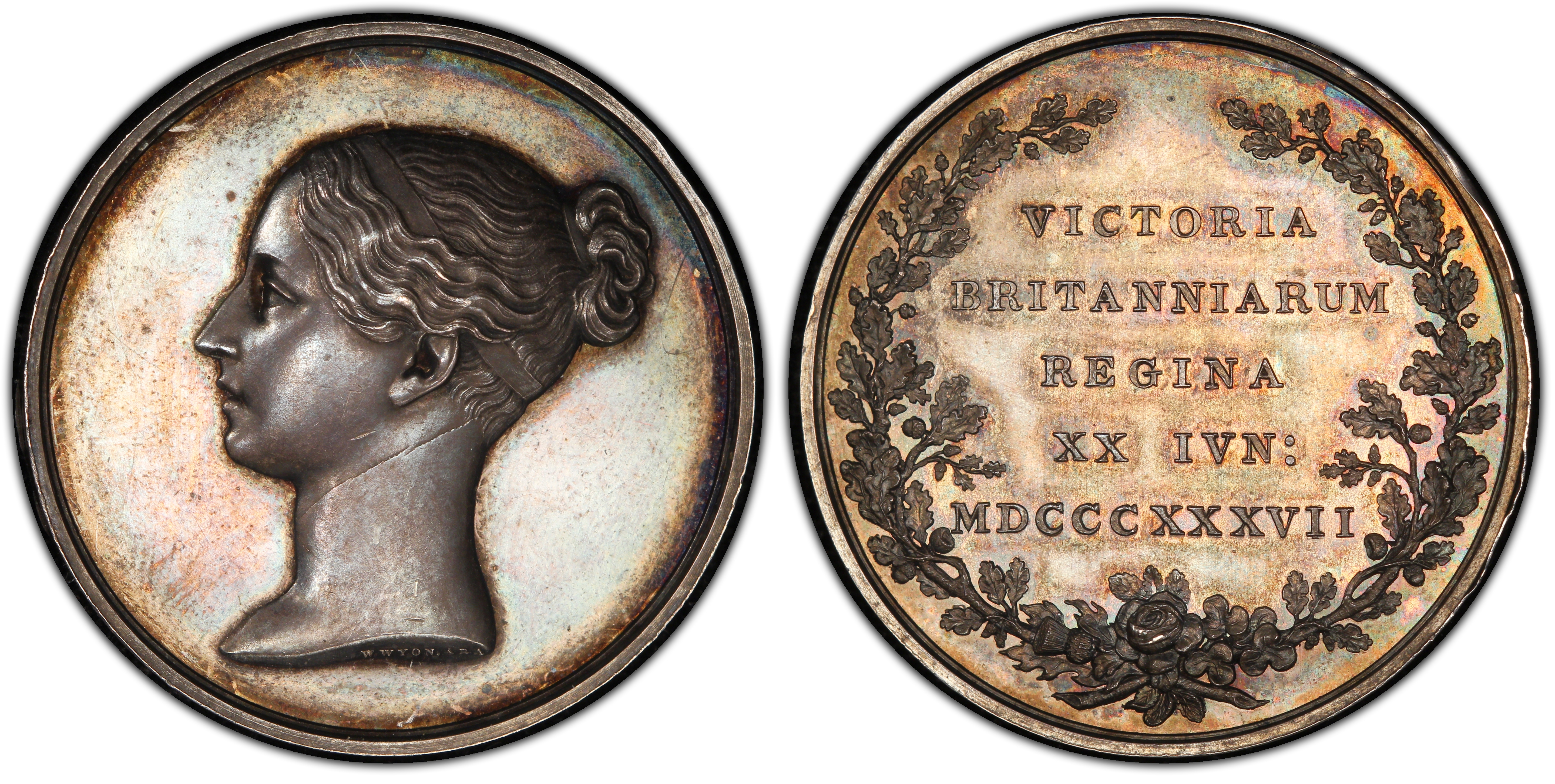 |
Victoria’s silver accession medal by Wyon. A very high resolution image is available immediately by clicking on the thumbnail image;
and further information is available at [PCGS].
|
 |
Victoria’s bronzed accession medal by Wyon. A very high
resolution image is available immediately by clicking on the thumbnail image;
and further information is available at [Collectors]. On the
obverse the front and back loops of the fillet are now patterned and a third
loop is added, over the top of the head.
|
The coinage included three half-loops of a plain fillet. Nowadays
familiarly known as the Young Head, the effigy’s features flattered the queen, who
retained it for all coinage into 1860 and was a grandmother in her late sixties
before she allowed it to disappear from the coinage entirely (after the 1887
gold sovereign). “You always represent me favourably”, she is reported to have
told Wyon, while he, for his part, is said to have found the queen an excellent
sitter [RMM].
Several months after her coronation, on 9 November 1837, in
accordance with a custom which had prevailed for many centuries, Queen Victoria
accepted the invitation of the Lord Mayor and the Corporation of the City of
London to attend the Mayoralty banquet. There was a procession to Guildhall in
which the Queen was drawn in a state coach drawn by eight horses and escorted
by lifeguards. [Weiss]
 |
| 1838, ½d British coin by William Wyon. Obverse: bust of Victoria facing left with plain fillets in her hair, engraved VICTORIA DEI GRATIA 1838 and signed W.W. on the neck truncation. Reverse: Britannia seated with a shield and trident atop the thistle, rose and shamrock, with legend BRITANNIAR: REG: FID: DEF:. Copper, 28mm in diameter. |
 |
1837, Victoria, Visit to the City of London by William Wyon. Obverse: bust of a diademed Victoria facing left, engraved VICTORIA REGINA and signed W.WYON R.A. on the neck truncation. Reverse: façade of the Guildhall, with exergue IN HONOUR OF HER MAJESTY’S VISIT TO THE CORPORATION OF LONDON 9th NOV: 1837. Bronze, 55mm in diameter.
Wyon also used the design in a smaller 22mm medal with the exergue simplified to “THE QUEEN VISITS THE CITY OF LONDON NOV, 9 1837” [Eimer87, p158]
|
 |
| George IV State Diadem, known officially as the Diamond Diadem, made by Rundell & Bridge for a commission by George IV in 1820. [CC] |
William Wyon was born in 1795
into a distinguished family of engravers and medalists [Forrer17].
In his boyhood he came across a copy of Flaxman’s Dante, and copied most of the
outlines with enthusiasm. He attended the Royal Academy where Flaxman was the
Professor of Sculpture; and Wyon went on to win the Society of Arts gold medal
for his head of Ceres. He was appointed to the position of Second Engraver at
the Royal Mint in 1816, after his anonymous entry was chosen by Sir Thomas
Lawrence as by far the most skillful. He was Chief engraver from 1828 until his
death in 1851. [ODoNB85]
Wyon’s work is often compared to
Flaxman’s: neo-classical in style, uncluttered and well-balanced.
Among Wyon’s prolific oeuvre is
the Three Graces pattern crown of 1817, the seated Britannia of the 1820s, the
Lion sixpences and shillings of George IV, and Una and the lion on the
reverse of the five-pound piece of 1839.
Still Wyon’s enduring reputation
rests principally on his coin and medal portraits of Queen Victoria. After the
medals and coins described here, he engraved a crowned bust in Gothic style in 1847, adopted for the proof crowns of that year and, later, for
the 1849 florins. About the same time he prepared another diademed portrait for
campaign and general service medals, and finally, shortly before his death, he
completed a portrait of the queen and the prince consort for the Great
Exhibition medals of 1851. [RMM]
How Alternatives to the Penny Black Faltered
After sustained lobbying for postal reform, the law
establishing penny postage per half ounce irrespective of distance was signed, in
1839. During the debate, many proposals had been made, most notably by Rowland
Hill, such as for an adhesive stamp.
Many questions remained, and the Treasury, which was responsible
for implementing the Act, swiftly initiated an open and multi-faceted consultation
process: six days after the Act became law, they drew up a notice, which was
published in many newspapers including The Evening Chronicle on September 6th,
1839. It described a competition with a £200 prize to the most deserving
proposal.
The goal of the competition was to solicit feedback: “Before
my lords [of the Treasury] can decide upon the adoption of any course, either
by stamp or otherwise, they feel that it will be useful if artists, men of
science, and the public in general, may have an opportunity of offering any
suggestions or proposals as to the manner in which the stamp may best be
brought into use.” Printers and engravers made a variety of valuable
submissions about stamp production, costs and security from forgery, but we
will keep our focus narrowly on the artistic responses.
Extract from page 3, The Evening Chronicle on September 6th, 1839. [BNA]
Newspaper image © The British Library Board. All rights reserved. With thanks to The British Newspaper Archive (www.britishnewspaperarchive.co.uk)
|
Adhesive postage stamps were not a foregone conclusion, since the notice raises several potential plans:
· Stamped covers (i.e. an envelope preprinted with a stamp)
· Stamped paper. This could signify one or both of:
o
A pre-paid lettersheet (i.e. a sheet of paper preprinted with a stamp). This accorded with the tradition of the day where, after writing on a sheet of paper, the letter-writer would fold the sheet in such a way that it could be sealed with a wafer of sealing wax, with the address written on the outside. No envelope was needed, and it is akin to the present-day aerogramme.
o
Stamps to be struck on paper of any description. Here members of the public would send their own paper to the Stamp Office, where it would be stamped and returned as a custom pre-paid lettersheet.
· Adhesive stamps (needing separate envelopes or non-pre-paid lettersheets: i.e. modern postage stamps), which were first proposed by Rowland
Hill to the Commissioners appointed to inquire into the management of the Post Office Department on 13 February 1837.
The former two had a more expansive canvas whereas the
latter two implied art in miniature.
Two days later, Rowland Hill was appointed to the Treasury
to assist the Government in making arrangements for putting the Penny Postage
scheme into operation. He reviewed the competition responses, which he
estimated at between 2600 and 2700 [Muir90, p81]
As no plan was proposed that was fit for adoption in toto,
no overall winner was declared [Muir90, p95] but four
groups were allocated consolation payments of £100: Messrs. Bogardus and Coffin
(who acted together), Mr. Benjamin Cheverton, Mr. Henry Cole, and Mr. Charles
Whiting [Muir90, p105]. The competition garnered such
gems as:
 |
| An example from Bogardus and Coffin’s submission, showing the queen’s profile. [TPM14] © Royal Mail Group 2020 Courtesy of The Postal Museum |
 |
| An engraving from Perkins, Bacon & Petch’s submission, showing the messenger god Mercury. [TPM47] © Royal Mail Group 2020 Courtesy of The Postal Museum |
 |
A portion of Sievier's submission, suggesting that the Head of Her Majesty be used within an embossed stamp. [TPM20]
© Royal Mail Group 2020 Courtesy of The Postal Museum
|
 |
| A selection of essays from Whiting’s submissions, including one showing the queen’s profile. [TPM22, TPM24] © Royal Mail Group 2020 Courtesy of The Postal Museum |
 |
|
© Royal Mail Group 2020 Courtesy of The Postal Museum
|
Coffin suggested “the Engraving might be the Queen’s head as
on the coins, or the arms of the United Kingdom or any other that might be
chosen” [Muir90, p80] and Sievier expressed similar
sentiments (above).
A steel die with Bogardus’ name on the rear was discovered
in Rowland Hill’s papers. The die includes an outline engraving of Victoria (above).
Cheverton explained that, as the eye was “educated to the
perception of differences in the features of the face, the detection of any
deviation in the forgery would be more easy – the difference of effect would
strike an observer more readily than in the case of letters or any mere
mechanical or ornamental device, although he may be unable, perhaps, to point
out where the difference lies, or in what it consists”. [Muir90,
p87]
Rowland Hill submitted a final report on the competition
entries. He repeatedly recommended that the Queen’s head be a part of the
designs and proposed Wyon as a suitable artist. Hill was empowered to commence
preparations for prepaid stationary (lettersheets and envelopes), stamped paper
and adhesive labels (i.e. postage stamps).
For the prepaid stationary, Hill’s colleague Henry Cole had
been consulting with John Thompson, a skilled wood engraver, and Sir Martin
Shee, President of the Royal Academy, to select designers. However, within a
few days, Henry Corbould called with an unsolicited design of Britannia,
Mercury and Ceres.
Evidently Hill and Cole were concerned with the Corbould
envelope since the next day they visited artist William Mulready, and three
days later he had produced what Cole described (in what seems to be vintage
Yes, Minister language) as “a highly poetic design”. Still, Hill endorsed the
design and it was engraved by John Thompson in wood from which a brass mould
was made. [Muir90, p120]
 |
| Henry Corbould’s unsolicited design for pre-paid stationary. [Muir90, p119] © Victoria and Albert Museum, London, reproduced following guidelines. |
 |
| The Mulready design for prepaid lettersheets and envelopes shows Britannia in the act of dispatching four winged messengers. The figures on each side of her are groups emblematical of British commerce in communication with all parts of the globe. On the left are East Indians on elephants directing the embarkation of merchandise; next Arabs with camels laden; next Chinese; on the right, American Indians concluding a treaty, and negroes packing casks of sugar. In the foreground on the one side, a young man is reading a letter to his mother, whose clasped hands express her emotion at its contents; on the other side is a group of three figures, each one eagerly pressing around to read, or at least to catch a sight of the welcome letter. The whole conception forcibly tells its story, and suggests emotions of gratitude at the universal blessings that flow from unfettering correspondence, which is but speech by means of written characters. [TGM1840, p533] |
Meanwhile Hill directed Wyon to work on a die for embossing
stamps onto the public’s paper. Wyon used Victoria in profile, and elected to
put a tiara on the Queen’s head following his earlier City Medal design. The
engraved head was passed to Charles Whiting to add an engine-turned background.
Wyon continued to refine the head die, first adding a pendant curl then
removing it, but the overall profile closely followed the City Medal. Wyon
further narrowed the oval engine-turned border and reduced the font size. [Muir90, p140-143]
However, there were on-going problems at the Whiting print
shop.
 |
| Stages of Wyon die proofs, January to June 1840 [TPM45]. © Royal Mail Group 2020 Courtesy of The Postal Museum |
 |
| Stages of Wyon die proofs, January to June 1840 [TPM44]. © Royal Mail Group 2020 Courtesy of The Postal Museum |
Worse, providing a stamp embossing service for paper
provided by the public was abandoned in October 1840, because of little evident
demand for the service and fears that it might encourage forgery of unrelated
revenue stamps. The design was instead retargeted for prepaid envelopes as a
replacement for the Mulready design; but these new envelopes with Wyon’s
embossed design (the Penny Pink) and a 2d envelope were not distributed until
early 1841. [Muir90, p141]
In this way, all of the competing designs battling for the
future of postal services had fallen by the wayside by the time that the first
postage stamp was issued. Moreover, the remaining competition, the Penny Pink envelope,
exhibited Queen Victoria facing left with a diadem, chignon and reinstated
pendant curl, based on a design by Wyon that cleaved closely to his own City
Medal. Plus ça change, plus c’est la même chose!
 |
| EP13 1d Pink (Penny Pink) Post Office Issue Addressed Envelope, Size F |
The Penny Black
In parallel with Mulready and Wyon’s efforts, Perkins, Bacon
& Petch was entrusted with producing the adhesive labels.
Jacob Perkins (1766-1849) was an
American inventor who developed siderography, a process that enables the
transfer of an impression from a steel plate to a steel cylinder in a rolling
press and thereby make unlimited reproductions of engraved steel designs.
Encouraged by Englishman Charles Heath (see later), Perkins travelled to
Britain in 1819 to bid for a Bank of England contract to print banknotes.
Although Perkins’ bona fides were established by partnering with Charles Heath,
along with Gideon Fairman who was Perkins’ printing business partner from
America, the partnership of Perkins, Fairman, and Heath did not win the
contract. Charles’ half-brother George Heath was soon another partner through
his financial contributions, and the partnership went on to print banknotes for
the many British and Colonial banks of the time.
Later, by mid-1829, Joshua Bacon (1790-1863), son-in-law of Perkins, who had also settled in England, bought out the Heath interest in the company, which then assumed the name Perkins, Bacon.
Next, Petch joined Perkins Bacon as an engraver in 1835 and the company kept the name until his death in 1852 whereupon the company became Perkins, Bacon & Co.
The agreement was for the partnership “to prepare a die ... to
be composed of the best engraving of Her Majesty’s portrait … executed by the
best artist surrounded by … engine-turned work”. On 16 December 1839, Hill wrote
a letter to Perkins, Bacon & Petch that specifically recommended Wyon’s
City Medal for the source of the portrait. [Muir90, p150]
Upon receipt of Hill’s letter, Perkins, Bacon & Petch
commissioned Henry Corbould to make drawing(s) of the Queen’s head from Wyon’s
medal. There is strong contemporaneous evidence for Henry Corbould’s
involvement: the cash book records a payment to Corbould for “Queen’s Heads” on
12 March 1840 [Bacon20, p14] and a die proof of the
Penny Black exists with the manuscript annotation Engravers Proof by Fredk.
Heath after Drawing by Henry Corbould, F.S.A. in Edward Henry Corbould’s
handwriting. [StampEngravers] [Christies95]
Henry Corbould (1787-1844) was
born in London to landscape and portrait painter Richard Corbould. Henry
studied with his father, and was at an early age admitted as a student of the
Royal Academy. Several of his paintings are in the National Gallery. Most of
his time was spent as a designer for books, and particularly making drawings
from ancient marbles in the possession of various English noblemen. The
collection of ancient marbles in the British Museum, on which he was engaged
for about thirty years, was in course of publication at the time of his death.
It is said that he “was surpassed by few in professional knowledge; no painter
of his time was more thoroughly acquainted with drawing; and his copies from
the antique may be referred to as models of accuracy and truth.” [WikipediaHC]
Henry Corbould was father to Edward Henry Corbould, who would be intimately involved in Humphrys’ second engraving of Victoria.
Henry Corbould was father to Edward Henry Corbould, who would be intimately involved in Humphrys’ second engraving of Victoria.
However, fast forward to the present day, and there is some
confusion as what those drawing(s) were and whether any of them survive.
There was a collection of about 80 drawings in a variety of
media – pencil, ink, and watercolour – of works by Henry Corbould which was
auctioned in small lots in 1919. Included in the auction was four portraits of
Queen Victoria and one (or all) were submitted to Perkins Bacon (& Petch)
on 18 October 1837. Each portrait is an elegant pencil and wash illustration of
Queen Victoria, and would find use in various banknotes. [Corbould]
In some accounts, it is presumed that these portraits also formed
the basis of the image of the Queen on the Penny Black postage stamp. This is
disputed by The Postal Museum archivist Douglas Muir [TPM30]
and indeed a cursory inspection proves they are not a waypoint between the Wyon
City medal and the visage used in the stamp:
Another interesting item from the collection was an engraving
of Wyon’s 1837 City Medal made by an anaglyptograph.
 |
Drawings by Henry Corbould of Victoria submitted to Perkins Bacon, and now part of The Postal Museum in London. The left two images show the full circle of the Diamond Diadem and the right two images more closely resemble the accession or coin effigy. The leftmost drawing is dated 18 October 1837 [left-to-right: TPM31, TPM32, TPM33, TPM34]
© Royal Mail Group 2020 Courtesy of The Postal Museum
|
 |
| Anaglyptograph of the Wyon City Medal from the collection of Henry Corbould’s works, and now part of The Postal Museum in London, captioned “Bate’s Patent Anaglyptograph Engraved by Freebairn”. [TPM30] © Royal Mail Group 2020 Courtesy of The Postal Museum |
An anaglyptograph is an ingenious
nineteenth century instrument comprising a gramophone-like needle that traces the
surface of a three dimensional object and, by its particular construction,
converts the relief movement of the needle (input) into a horizontal deviation
proportional to the relief height of the object (output). Crucially, by
attaching an engraving tool to the output, and placing a blank plate under
that, the anaglyptograph would engrave a copy of the three dimensional object.
Prints could be taken from the engraved plate and published in a books.
In the earliest times, a
technician would painstakingly trace the needle across the object hundreds of
times, each at a different offset. In later systems, a mechanical arrangement
replaced the human technician and enabled automatic tracing.
Higher quality could be achieved
by spacing tracing lines more densely, but it was also possible to synthesize a
directional light source: by choosing the azimuthal angle of the tracing lines
and the elevation angle of the needle, the engraving would have the sparsest
lines (and lightest apparent shade) for relief ascents at a selected angle and
the densest lines (and darkest apparent shade) opposite that orientation.
Further details are provided in this brief summary of the history and operation of the anaglyptograph.
Slid under a sheet of paper and backlit, this anaglyptographic
engraving of the City Medal would be an excellent basis for making a precise
copy of the original medal, and even determine the level of shading. The auction
item is captioned by collector R.M. Phillips with a claim that this
reproduction (A) was used for the four 1837 drawings (B) which were used in
connection with the 1840 stamp design (C). Yet the resemblance between the face
in this picture and the pencil drawings is not especially close, challenging
the connection from A to B. Further, from a discussion of the four drawings above,
the claimed linkage from B to C is doubtful too. Still a direct linkage from A
to C is hard to completely dismiss: perhaps Henry Corbould used this anaglyptograph
towards his 1839-1840 drawings?
If not those drawings, which? Muir has perhaps the most
intriguing theory. [Muir90, p150-151]
The inner left sketch above
is a stamp design that was later annotated by Rowland Hill’s son as being the “Original
sketch for the Postage Stamp (by Wyon)”. This is now held in the Royal
Philatelic Collection. Muir argues that the drawing was misattributed to Wyon –
that the artist was in fact Henry Corbould – and points to a) the time lapse
between the actual drawing and the annotation, and b) Wyon’s focus on an
embossed stamp rather than an adhesive stamp.
 |
| Leftmost: drawing by Henry Corbould of Victoria submitted to Perkins Bacon, and now part of The Postal Museum in London [TPM32]. Inner left: stamp design that was later annotated by Rowland Hill’s son as being the “Original sketch for the Postage Stamp (by Wyon)” [Bacon20, Plate II, item 3]. Inner right: proof from the first trial of the Penny Black with an engine-turned background, bearing text “HALF OUNCE POST OFFICE ONE PENNY” [Muir90, p153] . Rightmost: a similar item from [Bacon20, Plate II, item 6] captioned “Essays prepared by Perkins, Bacon & Petch for the stamps of 1840” scanned at a higher resolution but only showing “… FFICE ONE PENNY” clearly. First image: © Royal Mail Group 2020 Courtesy of The Postal Museum Third image: © Victoria and Albert Museum, London, reproduced following guidelines. Second and fourth images: copyright believed expired. |
Muir then adduces two pieces
of evidence. First he notes a similarity between this inner left sketch and the
leftmost sketch, which was taken from the same sheet of paper as one of Henry
Corbould’s 1837 drawings [TPM32]. More compellingly, Muir notes that Perkins, Bacon
& Petch submitted several backgrounds in December 1839 to Hill, including
some paste-ups with a silhouette paper portrait of Victoria pasted on top of an
engine-turned background in order to simulate a stamp. This is the inner right image
above, which reads HALF OUNCE POST OFFICE ONE PENNY arranged around an ellipse
just like the inner left sketch. In this way, the inner right Perkins, Bacon
& Petch paste-up is connected to the middle “Original sketch” and thence to
leftmost sketch positively attributed to Henry Corbould.
The argument certainly has
merit, yet even if the middle sketch were Henry Corbould’s sketch, it can only
have been a starting point since the Penny Black closely follows many of
the fine details of the Wyon City medal, none of which are captured by any
of these sketches. Yet, given the dates, there is a reasonable explanation:
Corbould produces a simple, early sketch for sizing in December 1839 (middle
design) and then refines it by March 1840.
Sadly, this refined drawing
seems mostly likely to have been lost sometime after 1853. [Bacon20, vol1, p14] reports “The miniature used for the
stamps, which was no doubt in water-colours and a beautiful work of art, was in
all probability destroyed sometime after the stamps were issued, in accordance
with the terms of the first contract entered into between the Commissioners of
Stamps and Taxes and Perkins, Bacon & Petch.” We can speculate that its
general style resembles that later work by Henry’s son: i.e. Edward Henry
Corbould’s water-colour of Victoria for Perkins Bacon and used as the basis for
the first issues of Ceylon.
Hill reviewed the Perkins,
Bacon & Petch designs and proposed detailed amendments on 31 December
1839. A die with the engraved background, and a space for the Queen’s head,
was crafted and passed to Charles Heath along with Henry Corbould’s lost
drawing. [Bacon20, vol1, p16]
 |
| Edward Henry Corbould’s 1855 water-colour of Victoria for use by Perkins, Bacon & Co. towards the first issue of Ceylon. [PBR53, vol 1, after p416, Plate XXIV]. Copyright believed expired. |
 |
| Penny Black reprints in rose, orange, brown, green and lilac, by Waterlow & Sons Ltd for the Stamp Centenary Exhibition, 1940. |
Charles Heath (1785 - 1848) was
an English engraver, currency and stamp printer, book publisher and
illustrator.
Heath received training in
engraving from his father James, and his first known etching dates from when he
was six years old. It was from his father that he learnt how to produce small
plates suitable for book illustration. Heath was a noted illustrator of Sir
Walter Scott’s Waverley novels, published 1814-1831, and engraved Christ
healing the Sick in the Temple, a large scriptural painting by Benjamin
West. Heath also engraved Richard Westall’s illustrations of Lord Byron's poems,
published in 1819.
As an engraver, Charles Heath
exhibited at the Royal Academy and Suffolk Street Gallery from 1801 to 1825.
After 1828 Heath outsourced much of the engraving work to others via a
production line technique.
It is interesting that Heath’s life
intersects with several characters familiar from the New Zealand Chalons. As
well as being a partner of Perkins for a time, Charles’ daughter Fanny Jemima
married Edward Henry Corbould in 1839 (but she died in 1850).
Frederick Heath (1810-1878) was
one of Charles’ sons and who followed in his father’s craft. Although both are
credited with the Penny Black engraving, Charles’ sight was fading, and a die
proof exists with the manuscript annotation Engravers Proof by Fredk. Heath
after Drawing by Henry Corbould, F.S.A. in Edward Henry Corbould’s
handwriting. [StampEngravers] [Christies95]
Frederick went on to engrave the
1856 New South Wales 1d, 2d and 3d stamps, the 1861 5/- coin stamp and Great
Britain’s 1870 small-format ½d newspaper stamp.
 |
| New South Wales, 3d yellow-green, 1856, engraved by Frederick Heath (SG115, S34a) |
The Dawn of the Upstart
For many years, Perkins,
Bacon & Co. was the dominant stamp printer for Great Britain and its many
colonies. Accordingly all these stamps were line engraved and it was the artists
and engravers associated with Perkins, Bacon & Co. (such as Henry Corbould,
Frederick Heath, Edward Henry Corbould and William Humphrys) who created the
designs.
After a competing offer in
1851 for the printing of the 1d Penny Red and 2d Penny Blue stamps, Perkins,
Bacon & Co. lowered their price but negotiated a sequence of long-term contracts
which allowed them to invest in plant for printing: for 1851-1856, 1856-1861 then
1861-1871. The latter contract was renegotiated in 1865 and ultimately led to a
new 1867-1879 contract [Bacon20, vol1, pp35-36]. Underlining this codependence,
after Perkins, Bacon & Co. suffered a catastrophic fire in 1857, the Board
encouraged them to invest in larger premises [Easton58,
p12-13].
At the same time, the great
success of the Penny Post had generated enormous demand for stamps, and Perkins,
Bacon & Co. was hard pressed to keep up: their printing was manual and
there was a high turnover of plates due to wear [PennyRedsS].
Innovation was needed, and because of Perkins, Bacon & Co.’s entrenched
position, that innovation would being initially with the high denominations.
The first experiment was a
failed one: the Royal Mint produced 6d, 10d and 1/- embossed stamps, one at
a time, over 1847-1854 [PennyRedsE].
The primary die was engraved by William Wyon based on his City Medal profile of
Victoria, now in an octagonal frame [WikipediaE].
The stamps were printed at Somerset House, an administrative venue divided among
many public offices and naval administrators.
The second experiment was led by Thomas De La Rue, and it
would transform the industry.
 |
| 1854 Queen Victoria Embossed 6d mauve, watermark VR reversed. Cut square with narrow margins, since stamps were printed very close (SG58, S7) |
Born in Guernsey in 1797 and
apprenticed to a printer at age ten, Thomas De La Rue set himself up as a
printer after ten years then, after another five years, decided to seek his
fortune in London.
As described in [Easton58, pxvi],
Thomas De La Rue “was endowed with unusual inventive genius, and himself
improvised what he could not obtain elsewhere.
“[First] he worked on paper
surfacing until he found himself in possession of the shining white art board
which enabled him to develop stationary and playing-card manufacture.” In 1844,
Thomas De La Rue hired Owen Jones, architect and artist, to design the backs of
the playing cards, which heretofore had been entirely plain. Jones would
develop 173 backs over 20 years, spanning fruit-and-flower themes to Chinese
and Arabesque. [WOPC]
Second, in 1841 De La Rue
received their first order for railway tickets. By 1846 they were producing a
million and a half tickets weekly, enough for nearly all the trains in the
country.
The third Thomas De La Rue
triumph was “the construction of an envelope-making machine [invented by Edwin
Hill (the older brother of Rowland Hill) and Thomas’ son Warren De La Rue in
1846 which enabled the firm to satisfy] the vast orders which followed in the
wake of the One Penny postage stamp.” Indeed the machine, which could fold 2700
envelopes an hour, was demonstrated with great success
at the Great Exhibition in 1851. [Easton58, pxvi]
 |
Backs of various De La Rue playing cards, 1860s vintage.
|
 |
| Stamp folding machine at the Great Exhibition, 1851 [DLR] |
In 1853 the Board of Inland
Revenue considered the production of adhesive stamps for drafts and receipts. Their
offices at Somerset House were already occupied with perforating the postage
stamp sheets from Perkins, Bacon & Co. and printing the Royal Mint’s
designs, yet Somerset House had no space spare for their expansion. Thus they
sought an outside vendor.
Given De La Rue’s history of
playing card artistry, and their reliable volume printing of railway tickets
and envelopes, they were a known and trusted vendor. But they did not have experience
in stamps.
Still, Thomas argued the
firm’s case for the contract, offering in particular to use their new typographical
process (which came to be known as surface printing or letterpress)
which was already proven by their playing card business. Thomas claimed three
key points of differentiation:
·
They would use special fugitive
inks, which would disappear if someone attempted to clean the stamp for
reuse.
·
Their stamps would be easier to
perforate. The Perkins, Bacon & Co. line engraving method required the paper
to be dampened first so that it could be pressed firmly into the plate’s
recesses. However a side-effect was erratic shrinkage, which made the stamps
difficult to perforate with consistent margins. By comparison, the
typographical method did not involve any dampening.
·
Their system was cheaper. Sir
Henry Cole, the former assistant of Rowland Hill and also the man who organized
the Great Exhibition, estimated that hiring De La Rue would save the Exchequer
£10,000 per annum.
De La Rue won the contract. With
Thomas’ personal attention to various printing experiments (first a wood block
engraving, then on brass and, once those attempts proved inadequate, upon
steel), plates for both a Draft Stamp and a Receipt Stamp were successfully
completed.
The wood engraving was
reportedly by W. Thompson [Easton58, p2; although we can
wonder, without any evidence, if “W.” is in error and the engraver was actually
John Thompson or his son Charles]. The design was a close approximation of the
Wyon / Henry Corbould / Heath profile of Victoria.
De La Rue would iterate several times on the border (and
text) and colours before the close of 1853.
 |
| Draft stamp (SG F2) and Receipt stamp (SG F3) |
We can infer that the British government was well satisfied
by the quality, price and prompt production of the revenue stamps, since they
awarded the next contract to De La Rue too, this time for a postage stamp: the 1855
4d carmine. Indeed De La Rue would win all subsequent British contracts for
postage stamps 2½d and higher until 1911, and displace Perkins, Bacon & Co.
from the smaller denominations from 1880 onwards too.
The Board of Inland Revenue engaged Joubert to engrave the
1855 4d carmine for surface printing by De La Rue. As an extension to the
existing Penny Red and Two-Penny Blue stamps, it made sense to use a similar design
and indeed in December 1853, Ormond Hill, son of Rowland Hill, directed Joubert
to use the Henry Corbould drawing as a reference [Easton58,
p3]. One deviation is that the rear half-loop of the fillet is "untwisted" and now comprises axial fibres in line with the base of the diadem.
 |
| Great Britain SG 62 4d Deep Bright Carmine with Queen St Box Cancel |
Jean Ferdinand Joubert de la
Ferté (1810-1884) was a French painter, line and mezzotint engraver, etcher, photographer
and inventor.
Born in Paris, pupil of
Henriquel-Dupont at the Ecole des Beaux-Arts from 1829; he seems to have been
domiciled in England from the early 1830s. Joubert was naturalised as a British
subject in 1855, the same year as he engraved Victoria for De La Rue’s British stamps.
He also engraved stamps for British Columbia Vancouver Island, Belgium,
Ceylon, Guatemala, Hong Kong, India, Italy, Jamaica, Malta, Mauritius, New
South Wales and the Confederate States. He exhibited variously at the Salon,
the Royal Academy and the Exposition Universelle in 1878. As an inventor,
Joubert devised the process of acierage, by which copper plates or electrotype
shells were coated with a surface of steel for longevity. This process was much
used by De La Rue. As well, Joubert was awarded the Silver Medal by the Society
of Arts for his process Application of Photography to the Production of Images
on Glass which can be burnt in in 1861. [WikipediaJ][BritMusJ][Melville16]
The Battle for the Colonial Market
Next, Perkins, Bacon & Co.
would lose their dominant position in the colonial stamp market. There were
many contributing events:
·
In 1855, Perkins, Bacon & Co. became over-stretched. Serving
Great Britain was their first priority, and the huge growth in the quantity of
stamps led to a breakdown in their ability to deliver plates for New South
Wales and Trinidad [PBR, pxxi]. This crisis was overcome,
but it was indicative of a certain brittleness in the printing company’s
resourcing
·
There was a clerk responsible for stamp orders, L. de Nicolas.
Percy de Worms rated him highly, commenting that “His letters are very clearly
expressed, and he appears to have been a man of good education and common
sense”. Regretfully L. de Nicolas died suddenly in 1856 and was replaced by
J.H. Upham, who de Worms rated as “obviously stupid”, “muddle-headed” and
“grossly careless” [PBR, pxxii].
·
The business interests of the colonial governments were
represented in London by Agents General of the Colonial Office, first George
Baillie and Edward Barnard, and then Penrose Julyan from 1858, and they were
also the Agents for the various colonial governments. There was a cordial
relationship between Perkins, Bacon & Co. and the first two men, but Julyan
took a stricter line: 1) given that stamps were a security product, he
considered that the dies, plates, paper and so forth paid by his department
should be strictly under his control, and 2) given Perkins, Bacon & Co.’s
erratic record of meeting deadlines, in new contracts he demanded a penalty
clause for delays. [PBR, p510]
·
In 1858, given an instruction to print 6d red and 1/- blue stamps
for Mauritius, Perkins, Bacon & Co. prepared 6d blue and 1/- red stamps
instead! [Easton58, p252]
·
By this time Joshua Butters Perkins (1790–1863) was in his late
sixties. By 1859, he had lost his ability to write and used J.H. Upham as his
amanuensis. This was not a success: for instance, names were misspelt and
initials were got wrong in vital letters. [PBR, pxxii]
Closely related, sensitive work was delegated to J.B. Perkins’ son, Jacob
Perkins Bacon, who signed off on Julyan’s penalty clause [PBR,
p511].
·
Perkins, Bacon & Co. almost immediately fell afoul of the
clause, for the stamps of Trinidad, Natal and Bahamas. One reason was that the
responsible engraver (presumably Humphrys) “fell seriously and sometimes
dangerously ill”. The two other reasons were that the three tendered delivery periods
were predicated on spaced start times but all tenders were accepted on the same
date. Finally there was unexpected paper shrinkage [PBR,
p511]. With the benefit of hindsight, most of these challenges could have been
side-stepped by more careful contract review, a deeper pool of vignette engravers, and more carefully written tenders, but that was not the case.
·
Things came to a head triggered by the affair of the handstamped
stamps. In 1861, Ormond Hill solicited specimens of new or uncommon stamps for
his friends (for official collections, as he would later explain). J.B Bacon
gladly acquiesced, and provided six stamp proofs of each kind that Perkins,
Bacon & Co. had prepared (excluding British stamps). Perkins Bacon &
Co. first obliterated each via a handstamp comprising “CANCELLED” between
parallel lines confined to an oval boundary. For each kind, Rowland Hill and
Pearson Hill would each get one stamp and Ormond Hill would get four.
Especially for stamps printed in the colonies, such as New Zealand, these
stamps are of appreciable historical significance since they represent how
Perkins, Bacon & Co. wished them to be printed. Still, Julyan discovered
the delivery and took great offense. He sent an official letter that stamps
should never leave Perkins, Bacon & Co’s hands in any state whatsoever
unless his department so ordered it. He followed that letter up with a request
that all dies, rollers and plates of every denomination be packed up and
forwarded to his office; and then a further request for all paper supplies and
moulds. Perkins, Bacon & Co. resisted each request for a time but
ultimately were obliged to comply, and by June 1862, all colonial assets were
in the hands of the Agents General for Crown Colonies. [PBR,
p513-526]
Odenweller
includes a near-complete, virtual reconstruction of the hand-stamped New
Zealand Chalons in [Odenweller2009, p33],
compiled from the Royal Philatelic Collection, the John Hackmey collection,
auction catalogues and other sources.
·
By 1860, through their printing of British stamps, De La Rue had
established a strong track-record of dependability.
·
Julyan developed a strong sense of trust in William De La Rue, a
younger son of Thomas De La Rue, and reportedly a man of great administrative
skills and charm [DLRLT].
·
Finally there was a marked contrast in the vendors and their
products: Perkins, Bacon & Co.’s patented line printing technology yielded
the more artistically appealing stamp designs yet the firm had a weak track
record of punctuality and (in Julyan’s eyes) security, and their stamps were
difficult to perforate due to the erratic shrinkage after the paper, which
needed damping for printing, dried. Their gumming was a point of vulnerability
too [Easton58, p11]. On the other hand De La Rue had established
a solid track record of printing enormous numbers of stamps quickly, cheaply and
securely, and the stamp sheets could be readily perforated.
In this light and with the benefit of hindsight, it is hard
to fault Julyan’s business choice in moving the colonial stamp business to De
La Rue. Indeed it does seem fair to assert that “The surface printed postage
stamps were a necessary evolution of stamp production”. [PennyRedsS].
Evidently Julyan’s superiors agreed since in 1874 he was appointed Knight
Commander of the Order of St Michael and St George for his work as Crown-Agent for the
Colonies.
De La Rue’s Colonial Designs
Unlike the varied designs of their packs of stamps, De La
Rue followed a very conservative path for their stamp designs. Until the end of
Victoria’s reign almost all their designs, for an enormous swathe of the
British Empire, used modest variations of the Joubert profile, albeit with a
wide variety of frames and backgrounds.
This was in large part of question of economics: De La Rue’s
standard price for designing a new vignette was £200 but for modifying an
existing vignette the price was just £50. And the choice of existing effigies was
essentially “any vignette you like as long as it is a subsidiary die from
Joubert’s profile engraving of Victoria” (with rare exceptions such as the swan
motif for Western Australia). Meanwhile De La Rue’s price for paper, printing
and gumming varied but the round price of 1/- per 1000 stamps was not atypical.
This meant that the colonies had the choice of a new vignette or around 3 million
stamps. Such financial considerations made the choice for small and moderately-sized
colonies alike very simple, and it led to a virtual monoculture of stamp
design, gathering steam in the 1850s, and remaining pre-eminent until the dying
days of Queen Victoria’s reign.
The main characteristics of De La Rue’s colonial dies were:
·
Adapt Joubert’s die of Victoria, or a subsidiary die, wherever
possible
·
Following in the tradition of the Wyon coinage and Wyon City
Medal, the colonial stamps were distinguished from earlier designs by changing
Victoria’s headwear but not anything else. This is demonstrated by a 23
December 1858 die proof of the head where the whole area of the diadem is solid
ready for engraving a new crown [Easton58, p248]
·
Several variants of the diadem were adopted; but none seem to be
modelled on specific royal crowns.
·
Create variation through the stamp colours, frames and colony
names. However, due to their evangelization of fugitive inks and doubly
fugitive inks, the colour options were constrained; for instance doubly
fugitive inks only came in green or lilac. [PennyRedsS]
The family tree of the De La Rue colonial designs actually
begins with an engraving by a freelance, Russell, for the East India Company in
1855. It did not transfer well and De La Rue reportedly replaced it a
subsidiary die of Joubert as soon as the opportunity arose, in 1859. [Easton58, p178].
The Joubert die has four colonial “child” dies: Ceylon ½d
engraved in 1857 [Easton58, p244] , the 1d, 2d, 4d, 6d
and 1/- values engraved for Jamaica in 1857 [Easton58,
p248], the 8 pies design of India engraved in 1859 and issued the next year [Easton58, p182 and p248] and lastly the Original Colonial
Die, which would be used first by the Sierra Leone 6d design of 1859 but also
by the British Columbia & Vancouver Island for their 2½d stamp of 1860, by Mauritius
for the 1d, 2d, 4d and 9d values of 1860, by Malta for their 1860 stamps, and
by New South Wales and Hong Kong for multiple issues from 1862.
 |
| From top left by rows: Progress proof of Ceylon die with the British diadem erased. [Easton58, Plate 21 after p256, item 6]; Ceylon ½d lilac, 1863 (SG48, S45), India 8Pies mauve, 1860 (SG53); Jamaica 1d blue, 1860 (SG1, S1); Sierra Leone 6d dull violet/purple, 1859 (SG1, S1a) and New South Wales 1/- black, 1871 (P13, small crown and NSW watermark) (SG38, S60) Top left: copyright believed expired. |
In turn the Original Colonial die begat three children: “In
1863, De La Rue adopted a more open style of engraving with a view to
simplifying the printing. To this group belong
(1) New Colonial Head B
(2) Jamaica Head for Threepence and subsequent new duties
(3) British Hondras ‘Florin Head’
Here again the photographic negative test reveals exact
coincidence in line, both between these three dies themselves and between them
as a group and Joubert’s Original Head for Great Britain. It is possible that
Pound re-engraved the features of the head, and added a new diadem, on a
replica of Jourbert’s die …” [Easton58, p249]
The New Colonial Head B was first used for the 1863 Bahamas
1/-.
 |
| Differences between the Original Colonial die on the left (Sierra Leone 6d dull violet/purple, 1859; SG1, S1a) and the New Colonial Head B on the right (Bahamas, 1863; 1/- green; SG39b, S15). |
Daniel John Pound specialised in copying carte-de-visite photographs of eminent men and women and actors and actresses in their theatrical roles, by John Jabez Edwin Mayall and other photographers, into a larger format, by stipple-engraving and line-engraving, for the London Printing and Publishing Company (1850s) and the Supplement to The Illustrated News of the World and National Portrait Gallery of Eminent Personages owned by The London Joint Stock Newspaper Company Limited (1858-1863). He died in 1894 [BritMusP]
The New Colonial Head B would be adopted prolifically.
Following the adage that a picture is worth a thousand words, this is a
compilation of the issuing postal authorities, ordered by use of a keyplate and then alphabetically:
 |
| Survey of postal authorities that used the New Colonial Head B head die |
 |
| World map showing the adoption of the New Colonial Head B design, which was concentrated in Africa and multifarious islands, especially in the Caribbean. Larger colonies, such as India and in Canada and Australia tended towards custom designs from a range of British, local or, in the case of the Canadian colonies, North American engravers. |
Perkins, Bacon & Co.’s Last Hurrah
Fast forward to the 1870. The British postage
on inland newspapers was reduced to ½d, and preparations for an appropriate
stamp had begun some six months earlier. Given the contractual situation, this
was a job for Perkins, Bacon & Co. As described in [Bacon20, vol1, pp190-194], Ormond Hill wrote to J.P. Bacon
“the P O authorities would prefer a design for the ½d stamp in which part of
the head and ground should be cut away to leave a white tablet in which ½d
should appear …” The next day he sent a further note “If you really think it could
be done in time I think it would be best for you to contemplate the engraving
of a reduced head for the ½d stamp and to have your designs prepared
accordingly.”
Perkins, Bacon & Co.
prepared and submitted ten sketches before the contract was signed. Select
examples are shown below, which initially leverage the printers’ existing
engravings (such as Frederick Heath’s profile for the 1d, 2d and 3d stamps of
New South Wales that were issued in 1856; Humphry’s second die for Van Diemens
Land, and so forth). Once the contract was signed, Perkins, Bacon & Co.
immediately engaged Frederick Heath, who first prepared a sketch of the reduced
head and then engraved it once it was agreed by the Commissioners.
 |
| Top left: Sketch for the ½d newspaper stamp reusing Frederick Heath’s engraving for the 1856 New South Wales issue; top-right: sketch for the ½d stamp reusing Humphrys second Chalon die; bottom-left: Frederick Heath’s reduced sketch; bottom-right: proof from the engraved and hardened die of the ½d newspaper stamp. [Bacon20, plates X and XI] Copyright believed expired. |
 |
| Great Britain, ½d rose-red newspaper stamp, 1870, Plate 15 (SG48) |
This British newspaper stamp would inspire New Zealand’s own
½d newspaper stamp. That stamp was designed by the Government Printer, John
Davies. A woodblock die was carved in Melbourne, Australia, and electrotypes
were produced from it by W.H. Kirk in Wellington. In this way, the ½d newpaper
stamp was the first stamp where the design, printing plate preparation and
printing plates were all completed in New Zealand.
 |
| Examples of New Zealand ½d newspaper stamps. Left-to-right: irregular star watermark, perf nearly 12, 1875 (CP:B2b, SG150); NZ and star watermark, P12½, 1892 (CP:B3a, SG151); double lined Z (from “NEW ZEALAND”) letter watermark, P12½, 1892 (CP:B3a(Y), SG151. |
New Zealand In Play, But Who Gets the Last Laugh?
At much the same time, the
Agent-General for New Zealand, Dr I.E. Featherston, was instructed in 1871 [TPSoNZ38v1, p101] to procure either new (line-engraved) plates
or electrotypes. [Easton58, p700] implies that this correspondence was sent to
De La Rue and thereby we can learn its contents, namely: “The Government here
have no facility for deciding between the two systems, and would prefer you to
determine the point, as the opportunities you have for procuring information
from the Imperial Post Office, and other sources, will better enable you to
decide which is the most preferable of the two systems.”
An updated design of Victoria
was not a mandatory objective since “I have to request you … to ascertain
whether the original plates … can be used for taking a number of electrotypes
from …” However, failing that, “it is desirable that, while retaining the
representation of Her Majesty on the stamps, the present design should be
improved upon – the two cents stamp of Nova Scotia affords an example.”
We can only piece together how Featherston undertook this
task, and sadly the main references don’t reproduce the original communications.
 |
| Nova Scotia 2c lilac, 1860 (SG11, S9) and 8½c deep green, 1860 (SG14, S11). |
The question is acute because, from [TPSoNZ38v1,
p101], Bradbury, Wilkinson & Co. submitted a line-engraved essay with a full
face portrait.
This vignette is very similar is to the 8½c, 10c and 12½c Nova
Scotia designs of 1860, produced by the American Bank Note Co. But the 1c and
5c designs and the aforementioned 2c design, issued at the same time, are
actually side faces.
 |
| Line engraved essay by Bradbury, Wilkinson & Co. [TPSoNZ38v1, p101]. Copyright believed expired |
Did Featherston mis-report his instructions to Bradbury,
Wilkinson & Co.? Or did Bradbury, Wilkinson & Co.misunderstand
Featherston, or think they knew better, or realized they needed to
differentiate themselves from De La Rue and the omnipresent Wyon sideface
design? Or did Featherston send a copy of his instructions to De La Rue and 8½c
or 12½c was mis-transcribed as 2c? Or was Easton’s “two cents” itself a
transcription error? The available archives should be able to validate or
disprove some of these possibilities (TODO [DLRA]) but in
many scenarios critical correspondence is surely lost and we cannot eliminate
all ambiguity.
Certainly De La Rue’s had their sideface design ready, and
our story ends with a whimper rather than a bang: [Easton58,
p701] reports that “the Crown Agents had agreed to the original die of the
Queen’s Head being used”. It is worth noting however that, for the five years
of 1873-1877, approximately 8.8 million stamps were printed per annum [TPSoNZ38v1, p105], so an alternative die would have been
the equivalent of many months of stamp revenue.
In De La Rue style, the stamps were issued in a range of
both colours and frames.
The 2/- and 5/- designs did not use De La Rue plates; rather
they were engraved in New Zealand by Messrs. Bock & Cousins in 1878, based closely
on the 2d De La Rue design. To modern eyes this appears to be a flagrant abuse
of De La Rue’s copyright (of the frame design), but a more definite conclusion
would require a detailed understanding of copyright law at the time and the
details of the contract.
 |
New Zealand 1874 First Sidefaces. White De La Rue paper, NZ and star watermark, line P12½: 6d (SG156, CP:C5c).
Lightly blued De La Rue paper, NZ and star watermark, line P12½, some missing perf teeth: 3d (SG168, CP:C3a(Y)).
White De La Rue paper, NZ and star watermark, comb P12x11½: 1d (SG180, CP:C1f), 2d (SG181, CP:C2f),
4d (SG182, CP:C4d), 1/- (SG184, CP:C6c), 2/- (SG185, CP:C7a), 5/- (SG186, CP:C8a).
|
From New Zealand’s perspective, this was a successful
experiment and so, when it was decided that fees for postage and duty would be
paid via the same set of stamps, Messrs. Bock & Cousins were again called
upon to engrave a new issue of stamps, following the design by the draughtsman
W.H. Norris. The same casual approach to De La Rue’s investments in the frame
design continued, as Norris reused De La Rue’s stamp designs to the greatest
extent possible, but remapped the denominations and elegantly made other
adjustments in order to incorporate “& Revenue”, as shown below:
The Second Sideface issue had several well-known flaws:
 |
First row: De La Rue’s designs for New Zealand’s 1874 First Sidefaces issue.
Second row: W.H. Norris designs for New Zealand’s 1882 Second Sidefaces issue. All NZ and star watermark (where “NZ” is 11½mm wide, and separated from the star by 7mm). P10x11: 1d rose (1895, SG228, CP:D2m). P11: 2d mauve (1895, SG238, CP:D3k), 3d pale yellow (1897, SG240, CP:D5h), 4d yellowish green (1895, SG241, CP:D6g), 6d brown (1897, SG243, CP:D8m), 8d blue (1898, SG244, CP:D9d), 1/- red-brown (1897, SG245, CP:D10k).
|
The Second Sideface issue had several well-known flaws:
 |
Left: 1d rose, Screwdriver flaw, NZ and star watermark, P11, 1897 SG237d, CP:D2p(U).
|
Summary
In summary, the New Zealand
Sideface stamps were a culmination of forty years of artistry and design
work: beginning with Wyon’s early sketches and medals and especially the 1837
City Medal, then passing through Henry Corbould’s drawing to Frederick Heath’s
engraving of the Penny Black; and resuming through Joubert’s reinterpretation
of Henry Corbould’s drawing, and developing into a family tree of De La Rue
surface-printed designs. In part due to the straightforward printing and in
part due to the superior economics, New Zealand made the same decision as many
other colonies and adopted a mature version of De La Rue’s engraving for their
First Sideface issue. These transitions are captured in the figure below.
 |
| Family tree of the sideface design leading to the New Zealand First and Second sidefaces. |
 |
| Major milestones of the sideface design: Wyon's City Medal, Perkins, Bacon & Petch's Penny Black (reprint for clarity), De La Rue's Fourpenny Carmine, Original Colonial Die and New Colonial Head B. |
Sideface References
[Carlisle1837]
Nicholas Carlisle, A Memoir of the Life and Works of William Wyon, 1837
[TGM1840]
The Gentleman’s Magazine, W. Pickering,
1840
[Stannard1859] William John
Stannard, Art Examplar, 1859; an encyclopedia of 55 printing methods from which
the Anaglytograph section is reprinted in Anaglytograph: Medal engraving for
book illustration, 1967, Plough Press.
[Melville16] Fred J. Melville, Postage
Stamps in the Making: Volume 1, Stanley Gibbons, 1916 (another wrote the second
volume)
[Forrer17] Leonard Forrer, The Wyons,
Biographical Dictionary of Medallists, Vol. VI. 1917
[Bacon20] E.D. Bacon, The Line-Engraved
Postage Stamps of Great Brtain Printed By Perkins, Bacon & Co., 1920
[TPSoNZ38v1]
R.J.G. Collins and H.T.M Fathers (editors), The Postage Stamps of New Zealand
(Volume I), Philatelic Society of New Zealand, 1938
[PBR53] Percy
de Worms, Perkins, Bacon Records: Volume I [up to p526] and Volume II [p531
onwards], Royal Philatelic Society London, 1953
[Easton58]
John Easton, The De La Rue History of Bristish & Foreign Postage Stamps,
1958
[ODoNB85]
Oxford Dictionary of National Biography, 1985
[Eimer87]
Christopher Eimer, British Commemorative Medals and Values, 1987
[Muir90]
Douglas N Muir, Postal Reform & The Penny Black, 1990
[Christies95]
https://www.barnebys.com/realized-prices/lot/proof-1840-february-die-proof-in-black-of-the-comnpleted-head-and-background-only-on-india-paper-mounted-in-sunken-card-showing-pencil-manuscript-engravers-proof-by-fredk-0580_ixv7z
[Odenweller2009] Robert P.
Odenweller, The Postage Stamps of New Zealand: 1855-1875, The Chalon Head
Issues, Royal Philatelic Society London and Royal Philatelic Society of New
Zealand, 2009
[Johnson2017] Dick Johnson et al, Medal
Engraving Machines and Anaglptography https://www.coinbooks.org/v20/club_nbs_esylum_v20n50.html#article14
and Vocabulary Term: Anaglyptography, Part 2 https://www.coinbooks.org/v20/esylum_v20n51a13.html
[BNA] British Newspaper Archive https://www.britishnewspaperarchive.co.uk/viewer/BL/0001315/18390906/008/0003 after login
[BritMusJ] https://research.britishmuseum.org/research/search_the_collection_database/term_details.aspx?bioId=119506
[BritMusP] https://research.britishmuseum.org/research/search_the_collection_database/term_details.aspx?bioId=110992
[CC] https://thecrownchronicles.co.uk/royal-news/queen-and-philip/queen-will-open-parliament-without-imperial-state-crown-for-the-first-time/
[DLRLT] https://cdn2.hubspot.net/hubfs/2752422/De%20La%20Rue%20Feb%202017/Images/Our%20Heritage/Blog_Post_Hard_Copy_(final).pdf?t=1524239481032
[DLRA] https://www.reading.ac.uk/special-collections/collections/sc-delarue.aspx;
TODO: Hire a local researcher
[TPM14] Phillips Collection, Volume I:
Reprints of 1839 Treasury Competition essays for adhesive stamps by Bogardus
and Coffin, p14 http://catalogue.postalmuseum.org/collections/getrecord/GB813_P_141_01_15
[TPM47] Phillips Collection, Volume I:
Samples of engraving produced by Perkins, Bacon and Petch, p47, http://catalogue.postalmuseum.org/collections/getrecord/GB813_P_141_01_48
[TPM20] Phillips Collection, Volume I:
1839 Treasury Competition essay submitted by Robert W Sievier embossed on a
printed page, p20 http://catalogue.postalmuseum.org/collections/getrecord/GB813_P_141_01_21
[TPM22] Phillips Collection, Volume I:
1839 Treasury Competition essay submitted by Charles Whiting, endorsed by
Rowland Hill, p22 http://catalogue.postalmuseum.org/collections/getrecord/GB813_P_141_01_23
[TPM24] Phillips Collection, Volume I:
Reprints of 1839 Treasury Competition essays submitted by Charles Whiting on a
decorative sheet, p24 http://catalogue.postalmuseum.org/collections/getrecord/GB813_P_141_01_25
[TPM27] Phillips Collection, Volume I:
1839 Treasury Competition essay, author unknown, p27 http://catalogue.postalmuseum.org/collections/getrecord/GB813_P_141_01_28
[TPM33] Phillips Collection, Volume I:
1839 Treasury Competition essay, author unknown, p33 http://catalogue.postalmuseum.org/collections/getrecord/GB813_P_141_01_34
[TPM30] Phillips Collection, Volume II:
Anaglytographic reproduction of the 1837 Wyon City Medal, p30 http://catalogue.postalmuseum.org/collections/getrecord/GB813_P_141_02_29
[TPM31] Phillips Collection, Volume II: Preliminary
drawing of Queen Victoria's head by Henry Corbould for the 1d black, p31 http://catalogue.postalmuseum.org/collections/getrecord/GB813_P_141_02_30
[TPM32] Phillips Collection, Volume II: Preliminary
drawing by Henry Corbould of statuary bust of Queen Victoria for the 1d black,
p32 http://catalogue.postalmuseum.org/collections/getrecord/GB813_P_141_02_31
[TPM33] Phillips Collection, Volume II: Circular
preliminary drawing of Queen Victoria's head by Henry Corbould for the 1d black,
p33 http://catalogue.postalmuseum.org/collections/getrecord/GB813_P_141_02_32
[TPM34] Phillips Collection, Volume II: Preliminary
drawing of Queen Victoria's head by Henry Corbould for the 1d black, p34 http://catalogue.postalmuseum.org/collections/getrecord/GB813_P_141_02_3
[TPM44] Phillips Collection, Volume I: Embossed
essay submitted after 1839 by William Wyon with transcript of a letter from
Rowland Hill, p44, http://catalogue.postalmuseum.org/collections/getrecord/GB813_P_141_01_44
[TPM45] Phillips Collection, Volume I: Photographs
of embossed essays submitted after 1839 by William Wyon, p45, http://catalogue.postalmuseum.org/collections/getrecord/GB813_P_141_01_45
[StampEngravers]
https://stampengravers.blogspot.com/2019/10/charles-and-frederick-heath-original.html
[Weiss] Historical
and Commemorative Medals, Collection of Benjamin Weiss, http://www.historicalartmedals.com/MEDAL%20WEB%20ENTRIES/CityofLondon/WYON-VISIT%20OF%20VICTORIA%20TO%20GUILDHALL-BW557.htm
Subscribe to:
Posts (Atom)